
Designing an Analytics Dashboard for Faster Operational Scanning
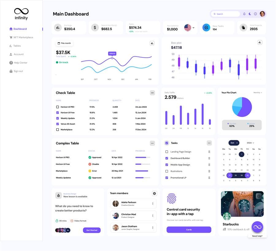
The Infinity dashboard concept explores how a dense operational view can help a user scan performance, notice exceptions, and move into action without giving every metric equal visual weight.
What is the recommended approach?
The interface supports the sequence from rapid orientation to a useful operational action.
What product problem does Infinity Dashboard address?
A useful dashboard must support rapid scanning while preserving enough detail for investigation. Metrics, charts, tables, tasks, people, and time all compete for attention, so the information architecture has to create a purposeful reading sequence.
Dashboards often become collections of every metric and widget a team might request. The result may look comprehensive while making it difficult to understand what changed, what matters, and what action should happen next.
How should the experience be structured?
The interface supports the sequence from rapid orientation to a useful operational action.
Infinity organizes the interface into layers: headline signals for orientation, trends for diagnosis, and operational modules for action. Reusable cards create consistency, but size and placement still communicate priority.
Which product design decisions matter most?
Prioritise decisions that make the main journey understandable, trustworthy, and usable before expanding the feature set.
- Create a top-level signal layer: Orientation comes first
- Use visual weight to express priority: Hierarchy is not decoration
- Keep operational modules actionable: Insight should lead to action
- Build modular consistency: A system supports growth
What should the product direction achieve?
The result demonstrates how multiple operational modules can coexist while maintaining hierarchy, consistency, and a route from signal to action.
- Headline context separated from diagnostic detail
- Reusable modules with differentiated visual priority
- Operational information connected to tasks, records, and time
Questions teams ask before they begin
Is Infinity the same project as Signal OS?
The local visual is branded Infinity, while historical site copy used Signal OS. This case study follows the visible asset and does not claim they are the same production product.
Is this dashboard connected to live data?
The available work documents an interface concept. No production integration or live operational result is claimed.
What should be validated before development?
Validate metric definitions, role priorities, scan order, exception handling, drill-down behavior, accessibility, and whether each module supports a real decision or workflow.
What supports this guide
The visible asset is branded 'Infinity,' while older Waka site copy called the image 'Signal OS.' This page uses the branding shown in the artwork and does not claim the names represent the same commissioned product. No live analytics, decision-speed, or productivity metrics are claimed.
View Waka's original portfolio workTurn the guide into a practical project plan
Waka can help clarify the workflow, define the right first release, and create a delivery plan around your users, risks, and business goals.