
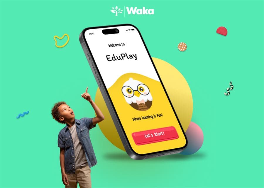
How to Design an EdTech App Children Can Use Independently
An EdTech app for young learners should make the next action obvious, keep instructions short, and use feedback to teach—not merely reward. EduPlay shows how that principle can shape a repeatable mobile learning journey.
What is the recommended approach?
Design the experience around one clear learning loop: choose an activity, understand one instruction, complete one interaction, and receive useful feedback. Keep navigation consistent and test whether a child can continue without an adult explaining the interface.
What makes an EdTech app easy for children to use?
A child-friendly learning app reduces choices, repeats familiar patterns, and explains each task in language the learner can understand.
Bright visuals can create interest, but they cannot repair a confusing journey. Start with the learner's reading level, motor skills, attention patterns, and likely device context before choosing interface styles.
- One dominant action per screen
- Short instructions supported by visuals
- Consistent placement for navigation and progress
How should the learning journey be structured?
Use a short loop that learners can understand once and repeat across lessons.
EduPlay follows four steps: choose, learn, practise, and progress. Subjects and activities can change while the underlying interaction model remains stable, reducing the need to relearn the product.
- Make resuming a lesson obvious
- Keep each activity focused on one objective
- End with feedback and a clear next step
What role should rewards and feedback play?
Feedback should first explain what happened; celebration should support that explanation rather than interrupt it.
Use encouraging language for another attempt, confirm why an answer worked, and show meaningful progress. Avoid turning every tap into animation or letting points become more important than the learning task.
How do you validate children's app UX?
Test comprehension and independence with age-appropriate participants before committing the interface to development.
Observe where learners hesitate, misread instructions, or ask an adult for help. Use guardian consent, accessible tasks, and a prototype that measures understanding—not only whether a screen looks engaging.
- Track assistance required
- Review task completion and errors
- Iterate language, hierarchy, and feedback together
Questions teams ask before they begin
What makes this an EdTech UX case study?
It documents the product problem, design goals, interaction decisions, reusable system, intended outcome, and current evidence level rather than presenting screens without rationale.
Was EduPlay released as a live product?
The material available to Waka documents a portfolio concept and prototype direction. This page does not claim a production launch or live-user metrics.
How should a concept like this be validated?
Use moderated prototype sessions with age-appropriate participants, guardian consent, clear comprehension tasks, and observation of where assistance is required. Findings should drive another design iteration before development.
What supports this guide
This is a Waka portfolio concept, not a commissioned-client performance case study. No live-product adoption, learning-outcome, or revenue metrics are claimed. The next evidence stage would be prototype testing with age-appropriate participants and guardians, followed by revisions based on observed comprehension and completion behavior.
- Age appropriate design: a code of practice for online servicesUK Information Commissioner's Office
- Cognitive and learning accessibilityW3C Web Accessibility Initiative
Turn the guide into a practical project plan
Waka can help clarify the workflow, define the right first release, and create a delivery plan around your users, risks, and business goals.