
Designing an EdTech App Children Can Use Without Help
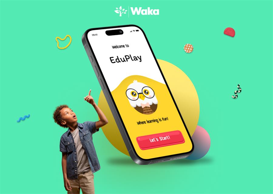
EduPlay explores how a child can discover a lesson, understand the next action, complete a playful activity, and recognize progress without navigating an interface designed for adults.
- Project type
- UI/UX concept
- Primary audience
- Young learners
- Waka's role
- Research, UX and UI
- Outcome
- Interactive concept
A learning experience built around independence
Many educational products add bright colors and rewards after the core experience has already been designed for adults. EduPlay started from a different question: what would the entire learning journey look like if clarity, confidence, and play were treated as product requirements from the beginning?
Waka shaped the concept around a short, repeatable loop: choose an activity, understand the task, receive immediate feedback, and see progress. The goal was not to add more interface, but to remove moments where a child would need an adult to explain what to tap next.
Making learning playful without making the interface noisy
A children's learning app has to balance competing needs. It must be visually inviting without overwhelming attention, simple without feeling empty, and rewarding without letting points replace learning. Navigation, language, feedback, and visual hierarchy all need to work together for users who may still be developing reading confidence and digital habits.
Make the next action visually obvious on every important screen.
Use playful feedback to reinforce learning rather than distract from it.
Keep navigation consistent enough for a child to build confidence through repetition.
Create a visual foundation that can expand across subjects and activity types.
The choices that shaped the product direction
The concept was developed as a connected system. Each decision supports the same outcome: helping a learner understand what to do without unnecessary explanation.
Design around one primary action
Each important screen gives visual priority to one decision. Secondary controls remain available, but they do not compete with starting or continuing the learning activity.
Clarity before feature densityTurn navigation into a repeatable rhythm
The experience uses familiar placement, recognizable shapes, and short labels so children do not have to relearn the interface as they move between activities.
Consistency builds independenceUse feedback as part of instruction
Responses should explain success, encourage another attempt, or reveal the next step. Celebration is useful when it confirms progress, not when it interrupts every interaction.
Feedback should teachBuild a system, not a single screen
Color, type, spacing, buttons, cards, and character moments were treated as reusable parts. That creates room for new lessons without allowing the interface to become inconsistent.
A scalable visual languageA four-part loop children can learn once and repeat
The framework keeps the product understandable as content expands. Subjects and activity styles can change while the learner's mental model remains stable.
Choose
Pick a clear activity or continue where learning stopped.
Learn
Receive one focused instruction in age-appropriate language.
Practice
Respond through a simple, tactile interaction.
Progress
See useful feedback and a clear next step.
From product framing to a reusable interface direction
- Product and audience framing
- Core learning journey
- Navigation and interaction direction
- High-fidelity mobile interface
- Reusable visual language
- Prototype foundation
A coherent concept ready for prototype testing
The result is a focused product direction that connects visual identity with a usable learning loop. It demonstrates how the experience can feel playful while keeping instructions, actions, and progress understandable.
A recognizable entry point for starting a learning session
A repeatable interaction model that can support multiple activities
A component direction that can grow into a broader EdTech product
What product teams can reuse from this work
- Children's UX is not adult UX with brighter colors; the interaction model must be simplified at its foundation.
- A reward is valuable only when it helps a learner understand progress or the next action.
- Reusable components matter early because educational products naturally expand across content types.
- The most important validation question is whether a child can continue without an adult explaining the interface.
About the project and its evidence
What makes this an EdTech UX case study?
It documents the product problem, design goals, interaction decisions, reusable system, intended outcome, and current evidence level rather than presenting screens without rationale.
Was EduPlay released as a live product?
The material available to Waka documents a portfolio concept and prototype direction. This page does not claim a production launch or live-user metrics.
How should a concept like this be validated?
Use moderated prototype sessions with age-appropriate participants, guardian consent, clear comprehension tasks, and observation of where assistance is required. Findings should drive another design iteration before development.
Plan an experience people can understand and trust.
Waka connects product thinking, interface design, development, and launch support in one delivery flow.